You can also read the steps Filter with the statistics panel and Display and use charts in the Getting started guide about this topic.
Here you will see all fields of the view with more than one value either grouped by categories or not grouped and sorted like their column in the log rows grid.
In the header of a field statistic section you will see the number of different values followed by the number of log rows with a value for the field.
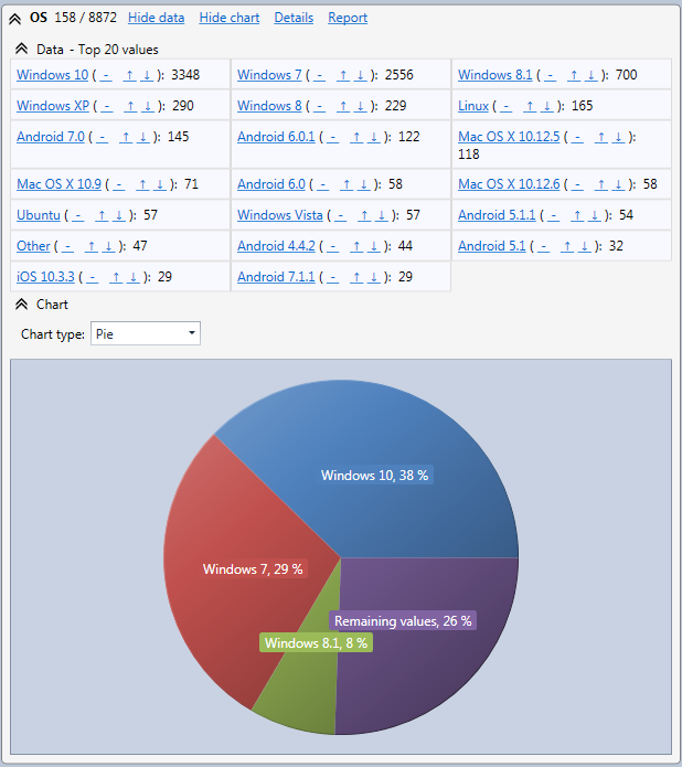
In the Data sub section you will see the 20 more frequent values with the number of log rows having the corresponding value. If you keep the mouse over this number, the percentage will be displayed in a tool tip.
If you right click on the value you will be able to copy it in the clipboard in order to paste it in another application.
If you need more information on the field, you can display the Detailed field statistics window from the header.
With the professional edition you can also display a printable report of the statistics by clicking on the Report link.
Below the Data section a Chart section can be displayed. For non-numeric fields and numeric fields with a small number of different values a pie chart is displayed. You will not see all values in the pie chart. Values with a too small percentage to be displayed in the pie chart are regrouped in a slice named Remaining values.

If the fields is not numeric and no value represent more than 5 % of the total number of rows a chart with the top 5 values will be displayed. The number of top values can be configured in the Preferences.
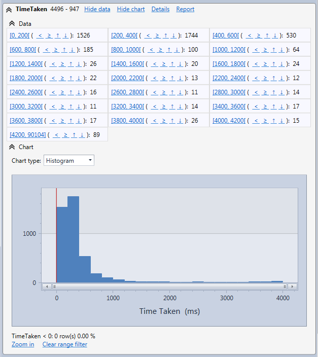
If the field is numeric and the number of different numeric values is too big a histogram is displayed with the values grouped by interval horizontally and vertically the statistics in each interval. When the mouse cursor is over a bar a tool tip is displayed with the start value of the interval and the statistics in this interval. The end of the interval can be determined with the start value of the next interval. If needed, you can zoom in the histogram by using the mouse wheel
When the histogram is selected the Data section looks different. You will see interval of values with the number of rows in each interval. If you click on an interval you will see all rows in this interval. You can also click on the < ≥ signs to display rows with a field value lower or higher than the interval lower bound.
Hereafter is an example with the TimeTaken field.

In any case if the type of chart automatically selected by the application doesn't suit your needs you can select another type with the Chart type selection box.