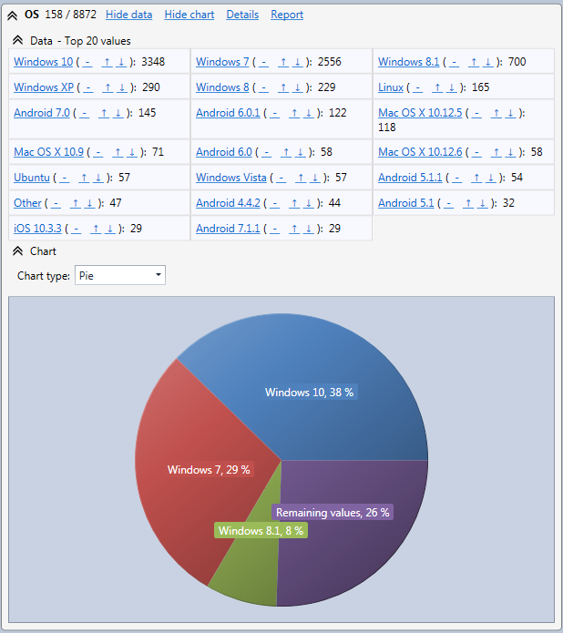
For each field you can also expand the Chart section to see a pie chart of the values breakdown for the field. If you double click on a slice in the pie chart the view will be filtered on the concerned value.
The slice labeled Remaining values regroups all values with a percentage too low (less than 5 %) to be displayed individually.

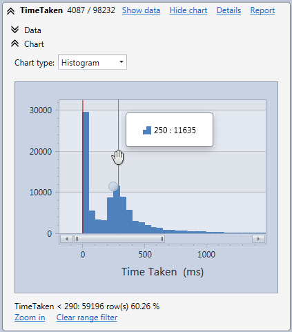
For numeric fields a histogram will be displayed. For example you can see hereafter the field TimeTaken. Horizontally, the time taken to execute requests appears in ms. Vertically you see the number of request in the range. It is also possible to zoom in the histogram by using the mouse wheel.

The type of chart is automatically selected depending on how values are distributed. If needed, you can select another type with the Chart type selection box.
In the next step you will see how to do advanced filters.